

The worst dashboard bugs aren't the ones that crash. They're the ones that keep rendering perfectly while quietly showing the wrong number. Revenue looks fine. The chart draws. Nobody notices for three weeks — until finance reconciles month-end and finds the "confirmed revenue" tile has been double-counting refunds since the last pipeline change.
That's the whole problem with dashboards. When a normal app breaks, you get an error. When a dashboard breaks, you get a confident, well-formatted lie.
Dashboard regression testing is how you catch that class of failure before it reaches the people making decisions. Not by manually eyeballing every tile after every deploy — nobody has time for that — but by building a lightweight test harness that runs the boring checks automatically. Smoke tests, canonical-row checks, delta assertions, snapshot comparisons, and a gate that blocks bad deploys.
This post walks through each layer with real query patterns and templates you can lift directly. It's written for analysts, not for people who live in CI/CD config files all day.
Why dashboard regressions slip through when everything else is tested
Most data teams already test something. Freshness checks, row-count assertions on source tables, dbt tests on primary keys. And yet dashboards still break, because those tests protect the inputs, not the outputs analysts actually look at.
The gap is this: a source table can pass every not-null and uniqueness test and still feed a dashboard tile that's silently wrong, because the breakage happens in the transformation logic between the clean table and the final metric. Someone changes a join from LEFT to INNER. Someone adds a filter to exclude test accounts and accidentally drops a real region whose account IDs happen to match the test pattern. Someone renames a column upstream and the dashboard falls back to a default of zero.
None of those trip a source-level test. All of them change the number an executive reads on Monday.
Teams invest heavily in data-quality checks at the table layer — which is genuinely worth doing, and we've written about automating transactional data quality with scheduled checks and remediation handoffs — but they leave the last mile, the actual dashboard output, completely untested. The metric definition changes, the tile updates, and there's no assertion anywhere that says "this number should still be roughly what it was yesterday."
Regression testing closes that last mile.
The five layers, and what each one actually catches
Think of the harness as five layers, cheapest to most involved. You don't need all five on day one. Most teams get 80% of the protection from the first three.
Stop missing critical business insights.
Glasaly helps you create, share, and track interactive dashboards effortlessly.
- Real-time data visualization
- Collaborative report sharing
- Customizable analytics widgets
No credit card required
| Layer | What it catches | How often it runs | Effort to build |
|---|---|---|---|
| Smoke tests | Dashboard query errors, empty results, null explosions | Every deploy + hourly | Low |
| Canonical-row checks | Known-value drift (a specific customer, a fixed date's revenue) | Every deploy | Low |
| Delta assertions | Unexpected jumps or drops vs. prior run | Daily | Medium |
| Snapshot comparisons | Structural changes — new/missing rows, shifted totals | Every deploy | Medium |
| Deployment gates | Blocks a bad change from reaching production | On deploy | Medium–High |
The mistake people make is starting with the hardest layer. They want the fancy snapshot-diffing system first, spend two months building it, and never ship. Start with smoke tests. You can have them running this afternoon.
Layer 1: Smoke tests — did the dashboard even survive?
A smoke test asks the dumbest possible question: does the query behind this tile run, return rows, and not return garbage?
You'd be surprised how often the answer is no. A typical failure looks like a tile that returns zero rows after an upstream schema change — the query technically succeeds, returns nothing, and the tile renders "0" or blank. Nobody's alerted because there's no error.
-- smoketest: dailyrevenuetile -- Fails if the tile query returns no rows, or a suspiciously null/zero total SELECT COUNT(*) AS rowcount, SUM(revenue) AS totalrevenue, COUNT(CASE WHEN revenue IS NULL THEN 1 END) AS nullrevenuerows FROM analytics.dailyrevenue WHERE reportdate >= CURRENTDATE - INTERVAL '7 days'; -- Assertions (run in your harness): -- rowcount > 0 -- totalrevenue > 0 -- nullrevenuerows = 0
The assertions are the part that matters. The query alone tells you nothing; the harness has to fail loudly when rowcount = 0 or nullrevenue_rows > 0.
A good smoke-test suite covers every tile that feeds a decision — not every tile. If a chart is decorative, skip it. If someone reprices inventory or approves headcount based on a number, that number gets a smoke test.
The single highest-value smoke test is a null-explosion check. When a join breaks, the most common symptom isn't zero rows — it's a flood of nulls that quietly drag averages toward zero. A tile showing "average order value: $41" when it's really $67 will never look wrong enough to catch by eye.
Layer 2: Canonical-row checks — the numbers you already know cold
This is the cheapest high-confidence test in the whole harness, and almost nobody builds it.
Pick a handful of facts you know are true and unchanging. Last completed quarter's total revenue. The order count for a specific closed date. A specific customer's lifetime value as of a frozen snapshot. These are canonical rows — historical values that should never change once the period is closed.
-- canonicalcheck: q32024closedrevenue SELECT SUM(revenue) AS q3revenue FROM analytics.dailyrevenue WHERE reportdate BETWEEN '2024-07-01' AND '2024-09-30'; -- Assertion: q3revenue BETWEEN 1284000 AND 1286000 -- (a tight window around the known reconciled figure of ~$1.285M)
If a pipeline change alters a closed period's revenue, that's almost always a bug — a reprocessed refund, a changed join, a timezone shift moving transactions across the date boundary. Canonical-row checks catch this instantly because the answer is supposed to be frozen.
The reason this works so well: it tests the whole path — source table, transformations, metric definition, and the final aggregation — with one assertion, against a value a human has already verified. You're not guessing at thresholds. You know Q3 was $1.285M. If it's not anymore, something moved.
Use a small window (like ±$1k) rather than an exact match, because tiny late-arriving corrections are normal. A wide gap means something structural broke.
Layer 3: Delta assertions — catching the "that jumped overnight" bugs
Smoke and canonical tests catch broken and frozen things. Delta assertions catch the sneakier case: a number that moves more than it should between runs.
The logic is simple. Compare today's value against the recent baseline and flag anything outside a sane band.
-- deltacheck: dailyactiveaccounts WITH today AS ( SELECT COUNT(DISTINCT accountid) AS val FROM analytics.dailyactivity WHERE reportdate = CURRENTDATE - 1 ), baseline AS ( SELECT AVG(dailycount) AS avgval, STDDEV(dailycount) AS sdval FROM ( SELECT reportdate, COUNT(DISTINCT accountid) AS dailycount FROM analytics.dailyactivity WHERE reportdate BETWEEN CURRENTDATE - 15 AND CURRENTDATE - 2 GROUP BY reportdate ) t ) SELECT today.val, baseline.avgval, (today.val - baseline.avgval) / NULLIF(baseline.sdval, 0) AS zscore FROM today, baseline; -- Assertion: ABS(zscore) < 4
A few hard-won notes on delta assertions:
Don't set the band too tight. Real businesses are spiky — Mondays differ from Sundays, month-end differs from mid-month. A z-score threshold of 4 catches genuine breaks without screaming every weekend. If you're getting daily false alarms, the check is too sensitive and people will start ignoring it, which is worse than not having it at all.
Compare like to like. A Monday should be compared against recent Mondays, not the flat 14-day average, if your metric has weekly seasonality. Otherwise you'll flag normal weekday swings as regressions.
Delta checks catch definition changes, not just data changes. When someone edits a metric definition and active-accounts jumps 30% overnight with no real-world cause, the delta check is what fires. This is exactly the kind of silent definition drift that a proper version-control workflow for metric definitions is designed to prevent — the delta assertion is your safety net for when a change slips through review anyway.
Layer 4: Snapshot comparisons — diffing the whole result, not one number
Sometimes the top-line total looks fine but the shape of the data underneath changed. Total revenue is right, but a region silently dropped out and another doubled to compensate. Aggregate assertions never see it.
The workflow in plain terms:
-
On each run, execute the tile's underlying grouped query (say, revenue by region by day).
-
Serialize the result and store it as the current snapshot.
-
Diff it against the previously approved snapshot
which rows are new, which disappeared, which changed by more than a tolerance.
-
If the diff exceeds your threshold, flag for review before promoting the new snapshot to "approved."
-- snapshotquery: revenuebyregion SELECT reportdate, region, ROUND(SUM(revenue), 2) AS revenue, COUNT(*) AS ordercount FROM analytics.orders WHERE reportdate >= CURRENTDATE - INTERVAL '30 days' GROUP BY reportdate, region ORDER BY report_date, region;
Your harness then compares row-by-row. A useful diff flags three things: missing rows (a region/date combination that existed yesterday and vanished today, usually a broken join or filter), new rows (combinations that appeared unexpectedly, often a test region or a null dimension leaking in), and value drift (rows present in both, but where revenue moved more than 2% for a closed date).
The last one is where the gold is. Value drift on a closed date is nearly always a regression. Value drift on the current date is often just fresh data arriving. Distinguish the two in your tolerance logic, or you'll drown in noise.
One thing worth flagging from real setups: snapshot tests are the layer most likely to be abandoned, because early on they flag everything and feel like pure noise. The fix is to snapshot only closed periods for strict comparison, and treat the current/open period loosely. Diff last month's regional breakdown with a tight tolerance; diff today's with a loose one or not at all.
A snapshot comparison workflow looks like this:
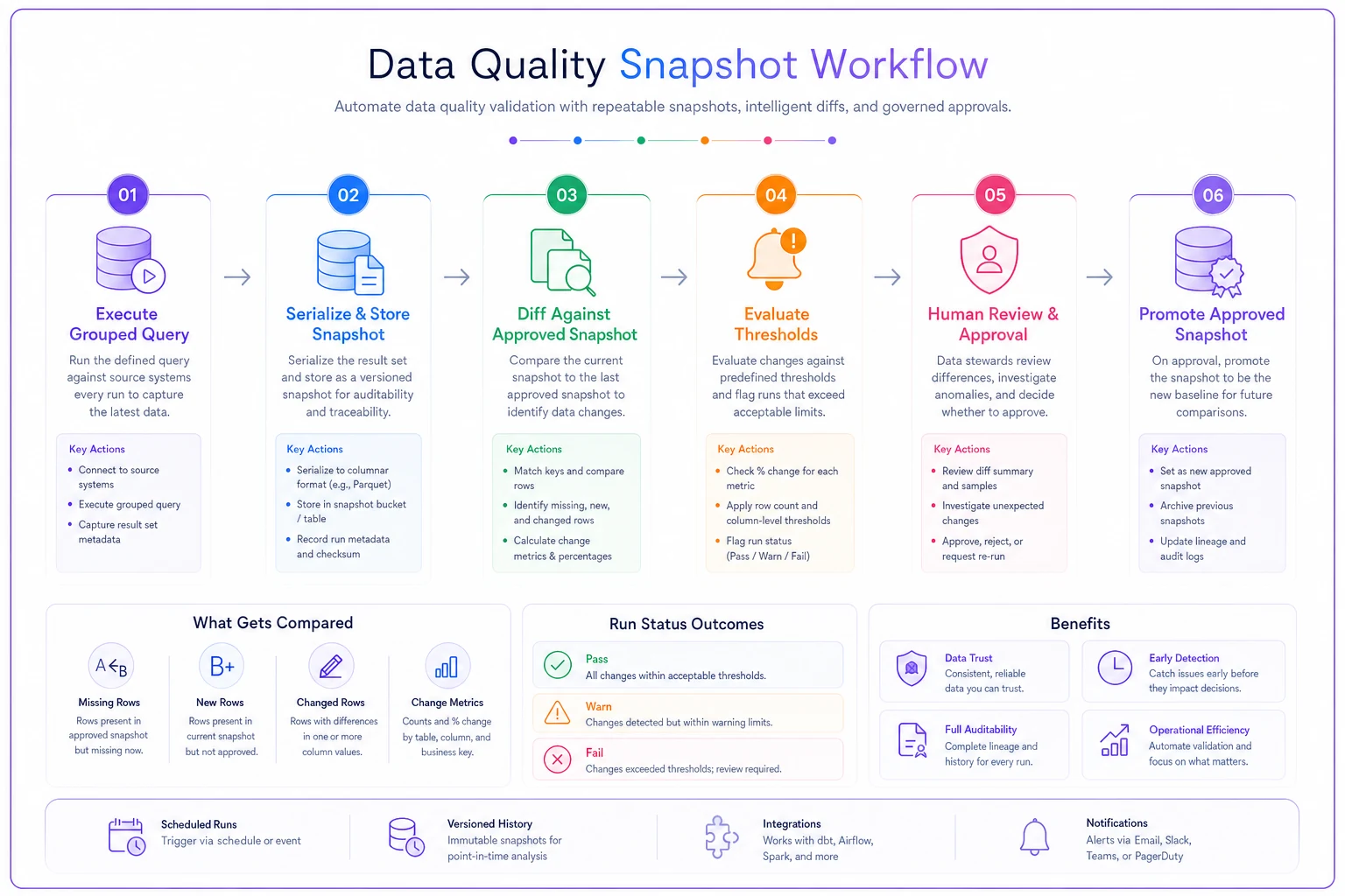
Keep closed-period snapshots strict and open-period snapshots loose to reduce noise.
Layer 5: Deployment gates — blocking the bad change before it ships
Everything above is worthless if a failing test doesn't actually stop the deploy. A gate is the rule that says: if the harness fails, the dashboard change does not go live.
ON deploy of dashboard/metric change:
-
Run smoke tests → any failure = BLOCK
-
Run canonical checks → any failure = BLOCK
-
Run delta assertions → failure = WARN, require manual approval
-
Run snapshot diff → closed-period drift = BLOCK; open-period drift = WARN
-
All pass or approved → PROMOTE change + update approved snapshots
Notice the distinction between block and warn. Not every anomaly is a bug. A delta spike might be real — a marketing campaign genuinely doubled signups. So delta and open-period snapshot failures should pause and ask a human, not hard-block. Smoke failures and closed-period drift, on the other hand, are almost never legitimate, so they block outright.
The gate is what turns a pile of tests into actual protection. Without it, tests are just a dashboard nobody looks at — which is a little ironic.
A real scenario: the mid-size ecommerce team that stopped reconciling by hand
A regional ecommerce operation — roughly 12,000 orders a month across four sales channels — had a recurring monthly fire drill. Every month-end, the finance analyst spent close to two days reconciling the "net revenue" dashboard against the accounting system, because the two never quite matched. Sometimes off by a few hundred dollars, sometimes by $6k–$8k.
The root cause turned out to be boring: refunds and channel-fee adjustments were being applied inconsistently after a pipeline change made months earlier. The dashboard had drifted, silently, and nobody had a way to know when it drifted.
They built a small harness. Smoke tests on the six tiles finance actually used. Canonical-row checks pinned to the last three closed months' reconciled totals. A snapshot diff on revenue-by-channel for closed periods. Nothing fancy — the whole thing was a set of SQL assertions run on each pipeline deploy plus a nightly schedule.
The effect was real. Month-end reconciliation dropped from roughly two days to a few hours, because the numbers matched by the time finance looked. More importantly, when a later schema change broke the channel-fee logic again, the canonical check caught it the same day — not four weeks later. The estimated hit avoided on that single catch was somewhere in the low thousands of misreported revenue, plus the credibility cost of another wrong month-end, which is harder to price but arguably worse.
The analyst's summary was blunt: the harness didn't make the dashboard better. It made it trustworthy, which was the thing that had actually been missing.
When this is worth it — and when it isn't
Not every dashboard deserves a test harness. Building one has a real cost, and over-testing a low-stakes chart is its own kind of waste.
When this actually makes sense:
-
The dashboard drives money or headcount decisions.
-
Multiple people edit metric definitions or upstream models.
-
You've been burned at least once by a silent wrong number.
-
Metrics feed reconciliation, board reports, or customer-facing SLAs.
When it's overkill:
-
One-off exploratory dashboards nobody reprices decisions on.
-
A single analyst owns the whole pipeline and reviews every change by hand anyway.
-
The metric is directional ("roughly trending up") rather than exact.
Who should NOT start here: teams whose underlying metric definitions are still a mess. If the same metric means three different things in three dashboards, testing won't save you — you'll just be asserting inconsistent numbers with high confidence. Sort out the definitions first; a governance framework and enforceable metric taxonomy is the prerequisite. Testing protects a definition you trust. It can't create trust in a definition you haven't agreed on.
A starter checklist you can run this week
If you want to go from zero to protected without a month-long project, here's the order that actually works:
-
List the 5–8 tiles that people actually make decisions on. Ignore the rest for now.
-
Write smoke tests for each
row count > 0, no null explosions, total in a sane range.
-
Pin 2–3 canonical values from closed periods you've already reconciled.
-
Add delta assertions on your 2–3 most volatile decision metrics, with a loose band to start.
-
Snapshot one dimensional breakdown (revenue by region/channel) for closed periods only.
-
Wire the smoke and canonical checks into your deploy step as hard blocks.
-
Route delta and open-period warnings to a human, not to auto-block.
-
Review false alarms after two weeks and loosen anything that cried wolf.
Snapshot comparison and full gating come last. That's deliberate. The early layers are cheap and catch the majority of real breaks. The later ones add polish but cost effort, and teams that try to build them first tend to stall out.
Where a platform helps versus where it doesn't
A lot of this can live in plain SQL and a scheduler, and for a small team that's often the right call. The friction shows up later — when you've got forty assertions, snapshot history to store, gates to enforce on every deploy, and someone has to remember why a particular threshold is set to 4 and not 3.
That coordination layer — scheduling the checks, storing approved snapshots, holding the gate, routing warnings to the right person — is where operational software earns its place. The point isn't the tooling. It's that the harness keeps running and keeps mattering after the person who built it moves on. A test suite nobody maintains quietly stops testing, and you're back to finding regressions at month-end.
Whatever you use to run it, the principle holds: the checks have to execute on every change, fail loudly, and block the ones that matter. A harness that runs manually when someone remembers is barely a harness at all.
Dashboards fail differently from software. They don't crash — they keep serving polished, wrong numbers with total confidence, and by the time someone notices, decisions have already been made on them. Dashboard regression testing exists to close that gap: smoke tests to confirm the tile survived, canonical-row checks against numbers you've already verified, delta assertions to flag suspicious moves, snapshot diffs to catch structural drift, and a gate that actually stops the bad change from shipping.
Start small. Five decision tiles, a handful of frozen canonical values, and a hard block on deploy. That alone catches most of what would otherwise reach your executives as fact. Everything else is refinement — worth doing, but only after the cheap layers are already saving you from the 2 a.m. "why doesn't revenue match" conversation.
Ready to elevate your business intelligence?
Join 2,500+ businesses leveraging Glasaly to drive smarter decisions, improve team alignment, and boost operational performance.