


Most measurement programs don't fail because teams pick the wrong metrics. They fail because there's no structure connecting the metric to a decision, the decision to a budget, and the budget to someone who has to sign off. You end up with a dashboard graveyard: 200 tiles nobody looks at, three "north star" candidates fighting for attention, and a finance team that has no idea why the data team wants another headcount.
An analytics strategy KPI hierarchy is supposed to fix that. But the version most companies build is a pretty pyramid slide that dies the moment it touches real budgeting. What actually works is a hierarchy that behaves like a funding pipeline—where every measurement request has to earn its way up, and where each level maps cleanly to who pays and who approves.
This is the systems view. Not "here are 10 KPIs to track," but how the whole thing connects, where it breaks as you grow, and how to build one that survives contact with a budget meeting.
Why the strategy-to-measurement link keeps snapping
The gap usually isn't intellectual. Leadership knows the strategy. Analysts know the data. The problem lives in the handoff, and it snaps in a few predictable places.
The first break is translation. A strategy says "become the low-cost provider in our region." That's a direction, not a measurable thing. Someone has to decide what "low-cost" means operationally—unit cost? delivered cost? cost-to-serve by segment?—and then which of those can actually be measured with the data on hand. In a lot of companies nobody owns that translation step, so it happens informally in Slack threads and never gets written down.
The second break is prioritization. Once you translate strategy into candidate metrics, you get too many. A mid-sized operation can easily surface 60–80 "important" metrics across departments. Everyone's metric feels critical to them. Without a forcing function, you either try to build all of them (and build none well) or you let the loudest VP win.
The third break is funding. This is the one people skip entirely. Building and maintaining a metric costs real money—pipeline work, data-quality checks, someone to own it when it breaks. A KPI hierarchy that doesn't attach a rough cost and an approval gate to each tier is just a wishlist. And wishlists don't get resourced.
Teams who succeed tend to treat the hierarchy less like a taxonomy and more like a capital allocation process. That reframe changes everything downstream.
The hierarchy as a funding pipeline, not a pyramid
Forget the visual pyramid for a second. Think in tiers that each carry a different funding decision and a different approval owner.
Stop missing critical business insights.
Glasaly helps you create, share, and track interactive dashboards effortlessly.
- Real-time data visualization
- Collaborative report sharing
- Customizable analytics widgets
No credit card required
| Tier | What lives here | Who owns the decision | Funding gate |
|---|---|---|---|
| Strategic outcomes | 3–5 lagging indicators tied directly to company strategy | Exec team / board | Standing budget, reviewed annually |
| Value drivers | Leading indicators that predict the outcomes | Department heads | Quarterly funding, tied to a hypothesis |
| Operational levers | Metrics teams can act on weekly | Team leads | Funded from existing ops budget |
| Diagnostic / exploratory | Ad-hoc metrics for investigation | Analysts | No standing funding—time-boxed |
The point of the table isn't the labels. It's that each tier answers a different question: what are we trying to achieve (strategic), what moves it (value drivers), what can we pull (operational), and what are we still figuring out (diagnostic).
The mistake almost everyone makes is funding the bottom tier as if it were the top. Someone builds 40 exploratory metrics into permanent, maintained dashboards, and now you're paying to keep 40 things alive that were only ever meant to answer a one-time question. That's how maintenance cost quietly eats a data team.
A cleaner rule: the higher the tier, the more you invest in reliability and the fewer metrics you allow. Strategic outcomes get real SLAs, real ownership, real backfill discipline. Diagnostic metrics get none of that on purpose—they're disposable by design.
Mapping leading and lagging indicators without fooling yourself
This is where most hierarchies get sloppy. People label something a "leading indicator" because it feels early, not because it actually predicts anything.
A lagging indicator tells you what already happened—revenue, churn, margin. A leading indicator should give you time to act before the lagging one moves. The test is simple and brutal: if this number changes, does the lagging metric reliably change 2–8 weeks later? If you can't point to that relationship in historical data, you don't have a leading indicator. You have a guess.
A typical example: a subscription business wants to improve net revenue retention (lagging). They assume "support ticket volume" is a leading indicator of churn. When they actually check the history, ticket volume has almost no predictive relationship—but ticket reopen rate does. Reopens climb 3–4 weeks before those accounts churn. So the value-driver tier should hold reopen rate, not raw volume. Same data source, completely different signal quality.
-
- Strategic outcome the lagging metric, defined precisely (owner, formula, cadence)
-
- Candidate leading indicators everything the team thinks predicts it
-
- Lead time how many weeks of warning it actually gives
-
- Correlation evidence what in the history supports the link (be honest—"none yet" is a valid answer)
-
- Actionability can a specific team do something when it moves?
-
- Data readiness do we already have this clean, or does it need investment?
Keep a simple reproducible query or notebook that shows the lead/lag correlation for each candidate indicator.
Those last two rows are what feed the funding decision. A leading indicator that's highly predictive but requires six weeks of pipeline work to produce reliably is a budget line, not a quick win. Naming that upfront prevents the classic "why isn't this on the dashboard yet" fight three months later.
Building the investment gates
Every tier crossing should require a gate. Not a bureaucratic form—a short, honest checkpoint that forces the "is this worth building" conversation before work starts.
Here's a workable gate sequence:
-
1. Intake. Someone proposes a metric and ties it to a specific strategic outcome or decision. If it can't be tied to either, it stops here. This kills roughly a third of requests on its own.
-
2. Cost estimate. The data team gives a rough build-and-maintain cost. Not a precise quote—a t-shirt size. "This is a two-day build with near-zero maintenance" versus "this needs a new source, ongoing quality checks, and someone to own it."
-
3. Tier assignment. Based on decision impact and cost, the metric gets slotted into a tier. This determines its funding source and reliability requirements.
-
4. Sign-off. The tier's decision owner approves the spend. Strategic-tier metrics go to the exec sponsor. Operational metrics stay with the team lead.
-
5. Build with a defined reliability bar. Higher tiers get monitoring, ownership, and quality gates. Lower tiers get built fast and flagged as disposable.
-
6. Review at cadence. Every tier gets re-examined on its funding cycle. Metrics that stopped driving decisions get demoted or retired.
The gate people resist most is #2, the cost estimate. Analysts hate giving numbers before they've scoped the work. But a rough size is enough. The whole point is to make the invisible cost of measurement visible to the people approving it. A metric that runs somewhere in the $8k–$12k range annually to keep alive deserves different scrutiny than one that costs an afternoon.
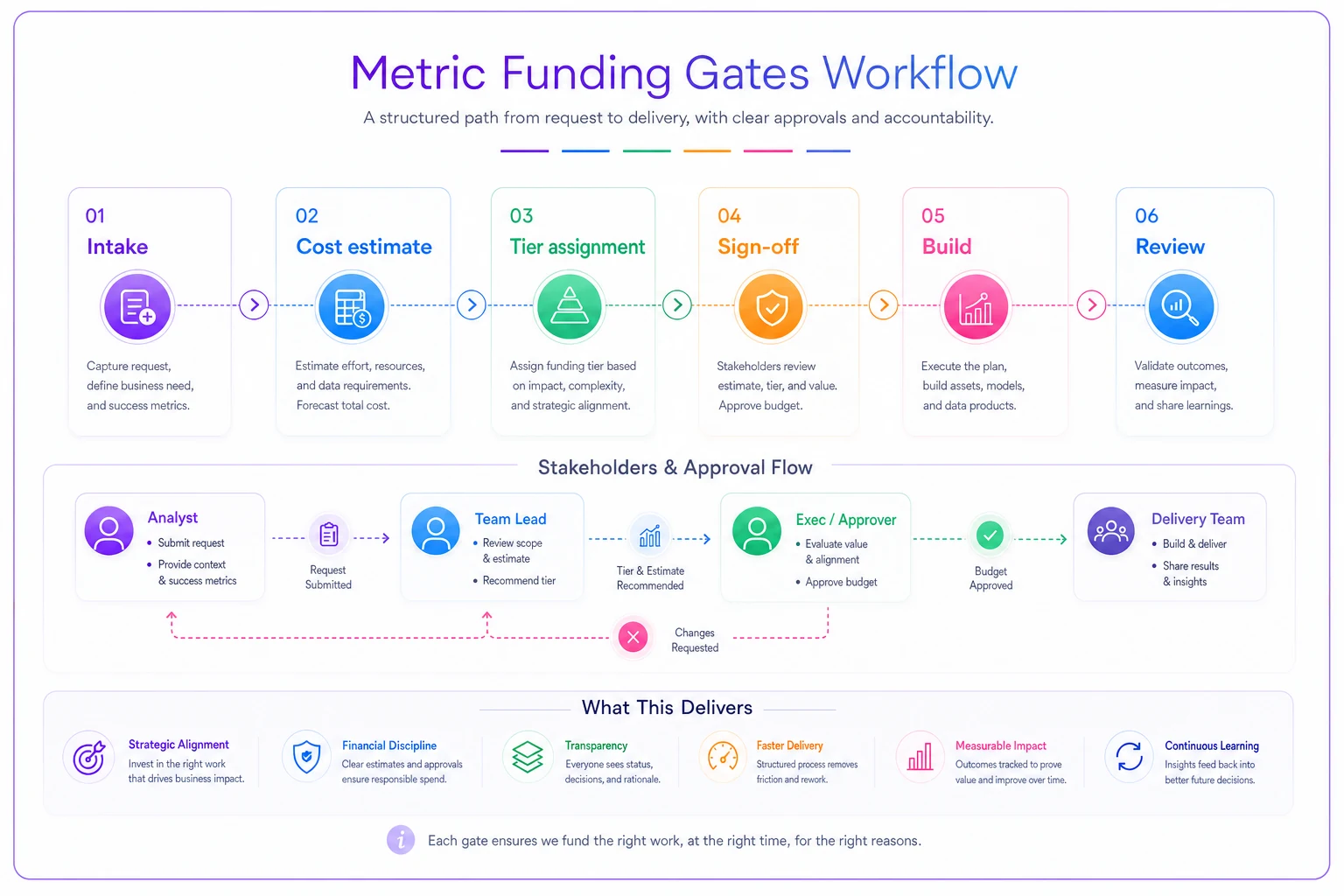
This flow highlights who owns each decision and where funding is allocated as a metric moves up the tiers.
Stakeholder sign-off artifacts that actually get used
A sign-off that lives in someone's inbox is worthless. The artifact has to travel with the metric and settle disputes later.
The most useful one is a one-page metric charter. Nothing fancy. For each funded metric it captures:
-
- The strategic outcome it supports
-
- Owner (the person, not the team)
-
- Definition and formula, written so two people can't interpret it differently
-
- Tier and reliability commitment
-
- Approved by (name and date)
-
- Review date
Six months from now, when two departments report different numbers for "active customers," the charter is what ends the argument. It's also what protects the data team when someone senior demands to know why a metric wasn't built—you can point to the intake decision and the sign-off that never happened.
Companies that run measurement as an internal service with real SLAs and lifecycle templates tend to already have the muscle for this. If you don't, the charter is the lightest possible starting point. One page, one owner, one approval.
The prioritization sequence tied to funding
Here's where the hierarchy stops being a diagram and starts driving budget. The sequence isn't "build the most important metrics first." It's "build the metrics that unlock the next funding decision first."
That distinction is subtle and it matters. Your strategic outcomes might be the most important metrics, but if they're pure lagging indicators, building them first tells you nothing you can act on this quarter. You'll have a beautiful dashboard of things that already happened.
-
- First, instrument the strategic outcomes even if they only update monthly. You need the scoreboard, and it's usually cheap because these metrics already exist somewhere.
-
- Second, build the value-driver leading indicators with the strongest historical relationship. These are what let you steer. Prioritize the ones with proven lead time and existing clean data—fast payoff, low cost.
-
- Third, fund the leading indicators that need pipeline investment, but only after their predictive relationship is validated. This is where real money gets spent, so it goes after you've proven the link.
-
- Fourth, build operational levers on demand as teams show they'll actually use them.
-
- Never fund diagnostic metrics permanently. Keep them time-boxed.
This sequencing front-loads cheap wins and back-loads expensive builds until they're de-risked. Finance sees results before they're asked to fund the heavy work. That's how you earn the budget for the harder tiers.
A real scenario
A regional home-services company—around 90 field techs, roughly $14M in annual revenue—had the classic mess. About 70 tracked metrics, four different definitions of "job completion rate," and a leadership team getting a 40-page weekly report nobody read past page two.
Their strategy was straightforward: grow revenue per truck without adding headcount. But nothing in their measurement stack connected to that. They were tracking everything and steering by nothing.
They rebuilt around a hierarchy. Strategic outcome: revenue per truck per month (lagging). Value drivers where they found real predictive relationships: first-visit resolution rate and average travel time between jobs—both moving 3–4 weeks ahead of the revenue number. Operational levers: dispatch density and quote-to-close time.
The prioritization sequence did the heavy lifting. Revenue-per-truck already existed in their billing system—cheap to instrument. First-visit resolution needed some cleanup but the data was there. The travel-time metric required real pipeline work to pull cleanly from their routing tool, so it went through a proper funding gate with a rough $9k build-and-maintain estimate and exec sign-off.
Six months in, the weekly report dropped from 40 pages to a focused set of tier-one and tier-two metrics. More importantly, dispatch started using travel-time and resolution data to adjust routing. Revenue per truck moved from around $46k/month to the low $50k range—not overnight, and not purely from measurement, but the team could finally see which levers were working. The retired metrics stopped costing maintenance time entirely.
The win came less from new metrics and more from killing the noise and connecting the survivors to a decision and a budget.
When this approach makes sense—and when it doesn't
This kind of structured, funded hierarchy is overkill for a five-person startup. If your whole team fits at one table and everyone already knows the three numbers that matter, formal gates and charters are just friction.
When it actually makes sense:
-
- You have multiple departments producing overlapping or conflicting metrics
-
- Data-team maintenance load is growing faster than headcount
-
- Leadership asks for metrics faster than anyone can build them well
-
- Budget conversations about analytics feel like guesswork
When it's a bad idea:
-
- You're pre-strategy—if the company direction genuinely changes every quarter, don't invest in a rigid outcome tier yet
-
- You have no data ownership at all; fix basic ownership first
-
- The real problem is a single broken pipeline, not a structural one
Who should not do this: teams treating it as a documentation exercise. If the hierarchy doesn't change what gets funded and what gets retired, you've built another slide. The whole value is in the gate and the sign-off having teeth.
Keeping the hierarchy alive as you scale
The failure mode at scale isn't building the hierarchy—it's letting it ossify. Strategy shifts, and the outcome tier should shift with it. A leading indicator that predicted churn last year may lose its relationship as the product changes. If nobody re-validates, you keep steering by a signal that's gone dead.
Build the review into the funding cadence. Strategic metrics get an annual hard look. Value drivers get re-validated quarterly—does the lead-time relationship still hold? Operational and diagnostic metrics get pruned continuously. A metric that hasn't informed a decision in two quarters is a candidate for retirement, no matter how much someone liked building it.
This is also where the connection to executive reporting matters. A well-built hierarchy feeds naturally into executive metric packs that trigger decisions—because you've already done the work of separating what leadership needs to decide on from what teams need to operate on. The tiers map almost directly onto what belongs in the boardroom versus what stays on the ops floor.
The measurement programs that endure aren't the ones with the most metrics or the prettiest dashboards. They're the ones where every number in the hierarchy can answer three questions without hesitation: which strategic outcome does this serve, who acts when it moves, and who agreed to pay for it. Get those three answers written down and enforced at the gates, and the strategy-to-measurement link stops snapping. It becomes the thing your budget actually runs on.
Ready to elevate your business intelligence?
Join 2,500+ businesses leveraging Glasaly to drive smarter decisions, improve team alignment, and boost operational performance.