

Most companies handle analytics requests like they're ordering lunch — whoever's nearby handles it, there's no clear process, and nobody really owns the outcome. Marketing needs conversion numbers, sales wants pipeline metrics, operations tracks fulfillment rates, and somehow the data team becomes this overwhelmed short-order cook trying to serve everyone at once.
I watched this exact scenario destroy a logistics company's analytics function. They had seven analysts, decent tools, and still couldn't answer basic questions like "what's our on-time delivery rate for California?" Why? Because they never built an actual analytics operating model. They had smart people and expensive software, but no system for turning data requests into reliable outputs.
The CFO would email urgent requests directly to analysts. Product managers would build their own dashboards in Excel. The sales VP had their own "shadow IT" setup pulling data from three different sources. Meanwhile, the official analytics team was drowning in ad-hoc requests, duplicate work, and conflicting priorities.
This isn't a tools problem or a talent problem. It's an operating model problem.
Why analytics breaks down without service structure
Think about any other internal service — IT, HR, facilities. They all have clear processes, service levels, and ownership models. You don't just walk up to IT and say "fix my computer sometime." There's a ticket system, priority levels, and expected response times.
Analytics typically operates nothing like this.
Someone needs a report. They message whoever they think might help — maybe someone in analytics, maybe a data-savvy colleague, maybe they try building it themselves. If they're lucky, they get something back in a few days. More often, the request gets lost, delayed, or produces something that doesn't quite answer the original question.
The analyst who gets the request has no framework for prioritizing it. Is this more important than the three other "urgent" requests from yesterday? Should they drop the quarterly revenue analysis to handle this quick dashboard request? Nobody knows because there's no service model defining these decisions.
Meanwhile, different departments start building their own analytics capabilities. Marketing hires a "marketing analyst," sales gets their own "sales operations analyst," and suddenly you have five different versions of "monthly revenue" floating around the organization. Each calculated slightly differently, each updated on different schedules, each telling a different story.
A mid-size retail chain had this exact problem multiplied across 22 locations. Store managers were creating their own inventory reports, the merchandising team had their own sales analytics, and corporate was using completely different metrics. They were spending roughly $400k annually on analytics salaries and tools, but couldn't get consistent answers to basic questions like "which products are underperforming?"
The breakdown happens in predictable stages:
Stage 1: Ad-hoc chaos Analytics requests come through email, Slack, hallway conversations. No tracking, no prioritization, no follow-up. Analysts work on whatever seems most urgent or comes from the loudest voice.
Stage 2: Shadow analytics Frustrated by slow or inconsistent responses, departments start doing their own analysis. Marketing builds dashboards in Google Sheets. Sales exports data to Excel. Operations creates their own reporting tools. Now you have data silos everywhere.
Stage 3: Conflicting truths Different teams present different numbers in meetings. "Marketing says conversion is up 15%, but sales shows it's down 3%." Trust in data erodes. Decisions get delayed while people argue about whose numbers are right.
Stage 4: Analytics paralysis The organization has tons of data, dozens of dashboards, hundreds of metrics, but can't make data-driven decisions because nobody trusts the numbers or knows which metrics actually matter.
The breakdown happens in predictable stages.
Building the service model framework
An analytics operating model isn't about bureaucracy — it's about creating predictable, reliable analytics delivery. Just like IT has help desk tiers and HR has standard processes for hiring, analytics needs structured service delivery.
Stop missing critical business insights.
Glasaly helps you create, share, and track interactive dashboards effortlessly.
- Real-time data visualization
- Collaborative report sharing
- Customizable analytics widgets
No credit card required
Start with defining analytics as an actual service, not just a team that exists. This means establishing what types of analytics work you actually provide. Not "whatever people ask for" but specific service types with clear boundaries.
Standard report maintenance might be one service — updating existing dashboards, fixing broken queries, adjusting calculations. This is your bread-and-butter operational work that keeps the lights on.
New dashboard development is a different service entirely. It requires discovery, requirements gathering, design, testing, and training. Treating it the same as "can you pull this number for me?" creates chaos.
Ad-hoc analysis represents another service tier — deep-dive investigations, root cause analysis, what-if scenarios. These are typically time-boxed investigations with defined deliverables.
Strategic analytics projects form your highest service tier — predictive models, optimization algorithms, major measurement framework overhauls. These are multi-week initiatives that fundamentally change how the business operates.
Every request needs a standard entry point. Not "message Sarah directly" or "catch Tom after the meeting." A single, visible process that everyone knows and uses.
This doesn't mean complicated forms and approval chains. A simple intake form asking: What question are you trying to answer? When do you need it? How will you use this information? Who else needs to see it?
One distribution company implemented this using a basic Airtable form. Requests dropped from 50+ random messages per week to 30 structured requests. More importantly, they discovered 40% of requests were for reports that already existed — people just didn't know where to find them.
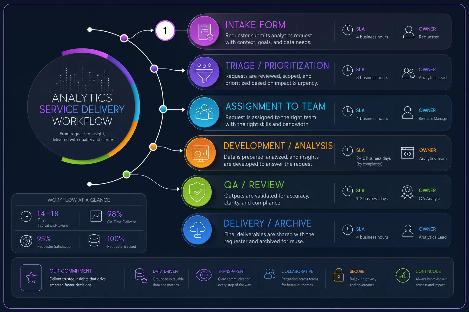
This workflow shows how requests move through the service model.
Not all analytics requests are equal. A board presentation needs different handling than a curiosity question from middle management. Without clear priorities, everything becomes "urgent" and nothing gets done well.
Define priority levels based on business impact, not organizational hierarchy. A store manager's inventory shortage analysis might be P1 if it's blocking $50k in orders. A VP's market research request might be P3 if it's for next quarter's planning.
Create explicit criteria:
-
P1
Revenue-impacting or compliance-required, needed within 24 hours
-
P2
Decision-blocking for active projects, needed within 3 days
-
P3
Planning and optimization work, needed within 1 week
-
P4
Nice-to-have analysis, completed as capacity allows
One distribution company implemented this using a basic Airtable form. Requests dropped from 50+ random messages per week to 30 structured requests. More importantly, they discovered 40% of requests were for reports that already existed — people just didn't know where to find them.
Service Level Agreements that actually work
SLAs for analytics feel weird at first. How do you put a timeline on "figure out why sales are down"? But without them, every request becomes an indefinite commitment, and requestors have no idea when to expect results.
The key is different SLAs for different service types:
Dashboard refresh SLAs
-
Critical dashboards
Updated by 8 AM daily, 99.5% reliability
-
Operational dashboards
Updated by noon daily, 99% reliability
-
Executive dashboards
Updated weekly by Monday 10 AM
-
Archived dashboards
No SLA, updated on request only
Request response SLAs
-
Initial acknowledgment
Within 4 business hours
-
Scope clarification
Within 1 business day
-
Delivery estimate
Within 2 business days
-
Status updates
Every 3 business days for active requests
Analysis delivery SLAs
-
Quick pulls (under 1 hour work)
2 business days
-
Standard analysis (1-4 hours)
5 business days
-
Deep analysis (4+ hours)
Scoped as project with timeline
A healthcare company used this SLA structure to transform their analytics function. Before SLAs, average request completion was 12 days with huge variance — some done in hours, others taking weeks. After implementing SLAs, they hit 85% on-time delivery within two months. More importantly, requestors knew what to expect and could plan accordingly.
The SLAs also revealed capacity issues. They discovered their team was committing to roughly 200 hours of work weekly with only 120 hours of actual capacity. The SLAs made this visible and forced priority discussions that were impossible before.
The metric ownership matrix
Most analytics programs fall apart here — nobody actually owns the metrics. Sure, someone built the dashboard, but who ensures the calculation stays correct? Who explains why the number changed? Who decides when to retire it?
A metric without an owner is just a number on a screen that slowly loses credibility.
The ownership matrix assigns three roles for every metric:
Business Owner This is the person whose job depends on this metric. For customer acquisition cost, it's probably the head of marketing. For inventory turnover, it's the operations director. They don't need to know SQL, but they need to understand what drives the metric and what actions to take based on it. Business owners are responsible for defining what "good" looks like for this metric, explaining significant changes during business reviews, requesting updates to calculation logic as business evolves, and training their team on how to use the metric.
Technical Steward This is typically an analyst who maintains the technical infrastructure. They ensure the queries run correctly, data sources stay connected, and calculations remain accurate. One technical steward usually handles multiple related metrics. Technical stewards handle monthly validation that calculations are correct, investigating and fixing data quality issues, implementing approved calculation changes, and documenting technical dependencies.
Data Source Owner The person responsible for the system generating the underlying data. For sales metrics, this might be the Salesforce admin. For website metrics, the marketing ops manager. They ensure data collection stays consistent and complete. Data source owners maintain data collection processes and standards, system configurations that affect data quality, access permissions and security, and communication about system changes that impact metrics.
Build this as an actual matrix, not just a concept:
| Metric | Business Owner | Technical Steward | Data Source Owner | Review Frequency |
|---|---|---|---|---|
| Customer Acquisition Cost | CMO | Marketing Analyst | Marketing Ops Manager | Monthly |
| Inventory Turnover | COO | Operations Analyst | ERP Administrator | Weekly |
| Employee Productivity | CHRO | People Analyst | HRIS Manager | Quarterly |
| Revenue per Customer | CFO | Finance Analyst | Billing System Admin | Monthly |
Without this ownership structure, metrics drift into irrelevance. Companies end up with dashboards showing metrics that haven't been correct for months because nobody owned them. The calculation changed, the data source moved, or the business logic evolved, but the dashboard kept showing the old numbers.
Meeting cadences and operational reviews
Analytics without regular review cycles is just expensive decoration. You need structured touchpoints to ensure the service is working and metrics are driving decisions.
Weekly analytics stand-up (30 minutes) Just the analytics team. What requests came in? What's blocking delivery? Who needs help? This isn't for status reports — it's for removing obstacles and balancing workload.
Format: 5 minutes on metrics for service delivery (SLA performance, request backlog), 15 minutes where each analyst shares their top priority and any blockers, 10 minutes to triage new requests and adjust assignments.
Bi-weekly stakeholder sync (45 minutes) Analytics team plus key business stakeholders. Review high-priority requests, discuss upcoming needs, and align on priorities.
Agenda includes SLA performance review, completed deliverables showcase, upcoming requests preview, and priority alignment discussion.
Monthly metrics review board (90 minutes) Cross-functional group that governs the metrics portfolio. This is where you add new metrics, retire old ones, and resolve conflicts about calculations or ownership.
Standing agenda covers metric health scorecard review, new metric proposals, retirement candidates discussion, and calculation change requests.
Quarterly analytics service review (2 hours) Comprehensive review of the analytics operating model itself. Are SLAs appropriate? Is the service catalog complete? What process improvements are needed?
Components include service delivery metrics and trends, customer satisfaction feedback, capacity analysis and resource planning, technology and tool requirements, and process improvement initiatives.
A software company implemented this cadence structure after their analytics function nearly collapsed under ad-hoc requests. Within six months, they reduced average request turnaround from 8 days to 3 days, while actually handling 30% more requests. The difference wasn't more people or better tools — it was having regular forums to coordinate work and make decisions.
Dashboard lifecycle management
Dashboards are like documents — they multiply endlessly unless you actively manage their lifecycle. Most organizations have dozens or hundreds of dashboards, many showing outdated information, conflicting metrics, or answering questions nobody asks anymore.
Every dashboard needs a defined lifecycle with clear stages:
Proposal stage Before building anything, document why this dashboard needs to exist. What decisions will it drive? Who will use it? How often? What happens if we don't build it?
Use a simple proposal template covering the business problem being solved, primary users and use cases, key metrics to include, expected usage frequency, and success criteria (how we'll know it's working).
Development stage Build with retirement in mind. Every dashboard should have clear documentation of calculations, named business and technical owners, defined refresh schedule, usage tracking enabled, and retirement criteria established upfront.
Active management stage Once live, dashboards need regular health checks: monthly usage statistics review, quarterly accuracy validation, semi-annual relevance assessment, and annual full review with stakeholders.
Track dashboard health metrics:
-
Views in last 30 days
-
Unique users in last 30 days
-
Data freshness (last successful refresh)
-
Data quality score (% of complete, accurate data)
-
Business value rating from users
Retirement decision framework When dashboards meet certain criteria, they enter retirement consideration: fewer than 5 views per month for 3 consecutive months, no unique users beyond the creator for 60 days, underlying data sources deprecated, business process changed making metrics irrelevant, or duplicate/conflicting with other dashboards.
Retirement process Don't just delete — follow a structured sunsetting:
-
Week 1
Flag dashboard with retirement notice
-
Week 2-3
Email users about pending retirement
-
Week 4
Move to "Archive" folder (still accessible)
-
Week 8
Remove from production if no objections
-
Week 12
Delete from system entirely
Document retirement reasons alongside usage stats to avoid rebuilding dashboards that were intentionally retired.
Document what was retired and why, so you don't rebuild the same thing six months later when someone new asks for it.
A retail chain used this lifecycle approach to reduce their dashboard portfolio from 400+ to 85 actively-used dashboards. They discovered that 60% of their dashboards hadn't been viewed in six months. The cleanup freed up 20 hours weekly in maintenance time and dramatically improved data quality in the remaining dashboards.
Templates and tools for immediate implementation
Here's the practical toolkit to implement this operating model:
Analytics Request Form Template Basic fields needed: requester name and department, request type (new dashboard/ad-hoc analysis/data pull/bug fix), business question being answered, deadline and flexibility, expected outcome/decision to be made, and previous attempts to find this information.
SLA Tracking Spreadsheet Column structure: Request ID, Date received, Priority level, SLA commitment, Actual delivery date, SLA met (Y/N), and Delay reason if applicable.
Metric Ownership Registry Required documentation: metric name and definition, calculation logic (plain English), data sources and dependencies, business owner with contact info, technical steward with contact info, review frequency and last review date, and related dashboards and reports.
Dashboard Health Scorecard Monthly tracking points: dashboard name and URL, creation date and creator, last modified date, view count (30-day rolling), unique users (30-day rolling), data freshness status, quality issues logged, and business value score (1-5 from users).
Service Catalog Document Service definitions including: service name and description, typical delivery timeline, required inputs from requester, standard outputs/deliverables, example use cases, and not included/out of scope items.
These templates seem basic, but they transform analytics from chaos to service. An insurance company implemented just the request form and SLA tracking, nothing else, and saw 40% improvement in stakeholder satisfaction within two months. People finally knew what to expect and when to expect it.
Measuring success of your analytics operating model
How do you know if your analytics operating model is working? Track these operational metrics:
Service delivery metrics SLA achievement rate (target: 85%+), average request turnaround time, request backlog size and age, and rework rate (requests requiring correction).
Utilization metrics Dashboard usage rates, metric adoption across teams, self-service success rate, and shadow analytics reduction.
Quality metrics Data accuracy incidents, metric calculation disputes, dashboard performance issues, and user-reported errors.
Value metrics Decisions explicitly tied to analytics, time saved through automation, revenue/cost impact of insights, and stakeholder satisfaction scores.
A manufacturing company tracked these metrics for a year after implementing their analytics operating model. They found SLA achievement improved from 45% to 89%, average request time dropped from 8 days to 3 days, shadow analytics spend reduced by $200k annually, and data-driven decisions increased from "occasional" to "standard practice."
The real victory wasn't the metrics themselves, but what they enabled. With predictable analytics delivery, business units could actually plan around data availability. Product launches included analytics from day one. Marketing campaigns had measurement built in, not bolted on later. Operations could identify and fix inefficiencies before they became crises.
Making the transition without disrupting operations
Moving from ad-hoc analytics to a service model feels like changing the engine while the car is running. But you can implement this gradually without disrupting existing operations.
Start with just the intake process. Keep handling requests the same way internally, but route everything through a single form or system. This immediately gives you visibility into request volume, types, and sources. You'll probably discover patterns you didn't know existed.
Add SLA tracking next. Don't change how you work yet — just start measuring how long things actually take. Most teams discover their estimates are wildly off.
"Quick pulls" that they thought took 30 minutes actually average 2 hours when you include back-and-
Ready to elevate your business intelligence?
Join 2,500+ businesses leveraging Glasaly to drive smarter decisions, improve team alignment, and boost operational performance.