



August's PMI print landed in an awkward spot. According to Reuters reporting, U.S. manufacturing activity eased last month while input prices stayed stubbornly high — new orders slowed, and supplier delivery performance weakened at the same time. That combination is what should get your attention. Softening demand usually drags cost pressure down with it. This time it isn't.
For analytics teams, that's basically the whole story: the correlations you normally lean on are drifting apart. When demand cools you expect freight to loosen, lead times to shorten, supplier quotes to soften. Right now you're getting slower deliveries and elevated costs simultaneously. If your dashboards were built assuming those two things move together, they're about to hand operations the wrong read heading into the busiest buying window of the year.
This isn't a "keep watching the macro data" post. It's about the specific analytics work — the metrics, the ownership, the alerting — that lets ops and procurement respond in days rather than catching the damage in the month-end close.
Start by separating the two signals that just decoupled
Most cost dashboards blend price and availability into a single "supplier health" view. That's fine when both move in the same direction. The moment they split, a blended view hides exactly what you need to act on.
-
Input‑price pressure — unit cost, landed cost, quote drift, surcharge frequency
-
Lead‑time / availability pressure — promised vs. actual delivery days, fill rate, backorder aging, expedite frequency
A supplier can hold their quoted price flat while their effective cost climbs because they've quietly stretched lead times and you're absorbing expedite fees to hit your own commitments. On paper the price index looks calm. In reality your landed cost per unit crept up somewhere in the 6–9% range through freight and rush charges nobody flagged.
The S&P Global data on weakening delivery times matters precisely because of this. When you read the S&P Global US Manufacturing PMI release, the supplier‑delivery component is telling you the lead‑time signal is deteriorating independently of the price signal. Your analytics need to reflect that separation or you'll keep reporting a "stable cost environment" while margins quietly erode.
Move 1: Build a landed‑cost view, not a purchase‑price view
Purchase price is the number people quote in meetings. Landed cost is the number that actually hits your margin. The gap between them is where August's environment does its damage.
Stop missing critical business insights.
Glasaly helps you create, share, and track interactive dashboards effortlessly.
- Real-time data visualization
- Collaborative report sharing
- Customizable analytics widgets
No credit card required
-
Base unit price from the PO
-
Inbound freight allocated per unit
-
Surcharges and fuel adjustments
-
Expedite/rush fees when applicable
-
Duties, tariffs, brokerage where relevant
-
Currency effects if you buy cross‑border
The trap most teams fall into: they build this once, load it into a quarterly review deck, and never make it observable weekly. In a stable environment that's fine. When cost and availability decouple, the surcharge and expedite lines are the fastest‑moving parts — and a static quarterly view completely misses them.
Track landed cost as a rolling weekly metric per SKU‑supplier pair, and flag when the freight-plus-surcharge portion grows as a share of total. That ratio climbing is your early warning that "the price is holding" is a lie.
Move 2: Instrument promised‑vs‑actual lead time with aging, not averages
Average lead time is one of the most misleading operational metrics there is. A supplier can hold a 14‑day average while a growing tail of orders quietly slips to 25–30 days, and the average barely moves because the on‑time orders mask the slow ones.
-
Delivery variance distribution, not the mean — look at the 90th percentile
-
Backorder aging buckets (0–7, 8–14, 15–30, 30+ days)
-
Slippage rate
share of POs delivering later than promised, tracked week over week
Consider a mid‑size industrial parts distributor that pulls their supplier data and sees a flat 12‑day average across the board. Looks healthy. Then they bucket by percentile and find the P90 quietly moved from 16 to 27 days over six weeks. That tail is where their expedite spend and stockout risk actually live — and the average told them nothing.
| Metric approach | What it shows | What it hides |
|---|---|---|
| Average lead time | General trend | Growing slow tail, variance |
| P90 lead time | Worst realistic case | — |
| On‑time % only | Headline compliance | How late the late ones are |
| Backorder aging | Where risk is building | — |
| Slippage rate WoW | Direction of change | Absolute severity |
Check the P90 and backorder aging every Monday to catch tail risk before it drives expedite spend.
The right column is why so many teams get blindsided — they're monitoring the metric that hides the problem. Building the habit of checking P90 alongside averages takes maybe an hour of dashboard work and saves weeks of firefighting.
Move 3: Assign real ownership to cost and fill‑rate metrics
This is the least technical move on the list and the one that fails most often. When input‑price and lead‑time metrics have no clear owner, a supplier deteriorating for three weeks becomes a fire drill in week four — because nobody was accountable for watching the drift.
Every core signal needs a named owner, an expected refresh cadence, and a defined threshold that triggers action. Not a dashboard someone might look at. A metric someone is responsible for.
-
Landed cost per SKU‑supplier → procurement analyst, weekly, alert on >5% WoW landed-cost move
-
P90 lead time by supplier → ops manager, weekly, alert on P90 crossing safety-stock reorder assumptions
-
Fill rate / slippage → supply planning, daily during volatility, alert on slippage >15%
-
Expedite spend → finance ops, weekly, alert on month‑to‑date pace exceeding budget run rate
"Everyone can see the dashboard" reliably means "no one is responsible for the number." Ownership is what converts a signal into a decision.
Move 4: Model margin scenarios instead of reporting a single margin
A single gross‑margin number is a rearview mirror. When costs are elevated and lead times are stretching, you need a forward view that answers: if this continues, where do we land?
-
Base
current landed cost and lead times hold
-
Pressure
input costs climb another 4–6%, expedite frequency rises
-
Relief
demand softening finally pulls costs down late in Q4
You don't need a sophisticated model. A spreadsheet-grade scenario that flows landed cost through to gross margin by product line is enough to make the buying conversation concrete. The value is that procurement and finance are arguing over the same three futures instead of trading anecdotes.
The common mistake is over‑engineering it. Teams spend three weeks building an elaborate model and miss the decision window entirely. A rough scenario delivered Tuesday beats a perfect one delivered after the POs are already placed.
Move 5: Set alerting on supplier KPIs — before the close, not after
Month‑end is too late in this environment. Q4 inventory and pricing decisions get locked in the next few weeks, and a supplier signal you catch in the month-end close is one you caught too late to act on.
-
Landed cost jumps beyond threshold on any high‑volume SKU
-
P90 lead time crossing the assumption baked into safety stock
-
Slippage rate acceleration week over week
-
Expedite spend outpacing its run rate
-
Any single supplier concentration risk climbing while their reliability drops
Keep the alert list short and consequential.
Here's a quick visual of a simple alerting workflow.
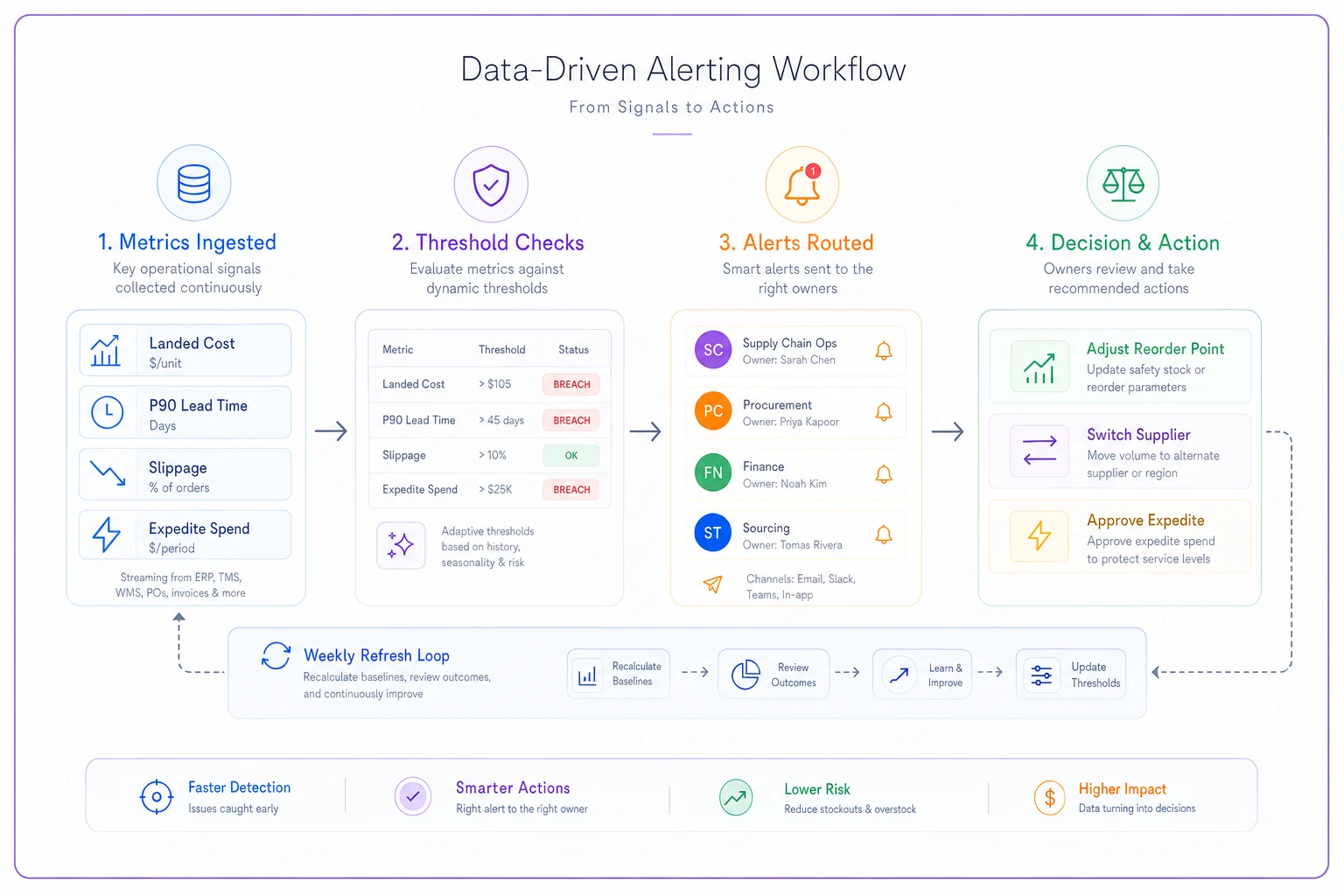
The failure mode isn't too few alerts — it's fifty low‑value alerts that train everyone to ignore the channel. Three alerts that reliably mean "make a decision" beat thirty that mean "maybe glance at this."
Move 6: Watch supplier concentration as reliability degrades
When delivery performance weakens across the board, your most‑concentrated suppliers become your biggest exposure — and that's invisible if you're only tracking cost and lead time in isolation.
Pull a simple view: share of spend by supplier, cross‑referenced against that supplier's slippage rate. The suppliers worth worrying about sit in the top‑right — high concentration, rising slippage. That's where a single delivery failure cascades into a stockout you can't quickly cover, because there's no alternate source spun up.
Take a specialty food manufacturer sourcing roughly 40% of a key ingredient from one supplier whose P90 lead time just drifted from 18 to 29 days. The cost line looks fine. But that concentration‑plus‑slippage combination is the actual risk, and it only shows up when you overlay the two dimensions. Reviewing that overlay weekly during a volatile stretch is cheap insurance.
Move 7: Tie it back to inventory and reorder logic
All of this analytics work is worthless if it doesn't change a reorder point. The connective tissue between your supplier signals and your actual inventory decisions is where margin gets protected — or lost.
When P90 lead time stretches, your safety stock assumptions are stale by definition. When landed cost climbs, your reorder economics shift. Teams that handle this well don't treat supplier analytics and inventory analytics as separate reports — they wire them together so a lead‑time signal automatically flags which reorder points need review.
This is the operational thread we walked through in the import volatility playbook for inventory, procurement and margins, and August's decoupling of cost and availability makes that connection more urgent. Rising costs with degrading delivery is the specific combination that breaks static reorder assumptions fastest.
A short real scenario
Business: regional HVAC equipment distributor, roughly 1,200 active SKUs.
Problem: heading into fall, their monthly cost review showed supplier prices "basically flat." Ops felt the pain anyway — expedite fees were climbing and a few product lines kept stocking out.
What they changed: they split the blended supplier metric into landed cost and P90 lead time, assigned owners, and added weekly alerting. The landed‑cost view immediately showed the flat "price" was masking freight‑plus‑expedite creep of about 7% on their top movers. The P90 view showed two suppliers stretching well past the lead time baked into their reorder points.
Outcome: they adjusted safety stock on the affected lines, moved roughly 15% of volume on one high‑slippage supplier to a backup source, and pulled their expedite run rate back toward budget over the following two months. Margins didn't magically recover — the cost environment was still tough — but they stopped absorbing avoidable expedite fees and cut the stockout events that were hurting fill‑rate on their best accounts.
The change wasn't a new tool or a fancy model. It was separating two signals that had quietly decoupled, and putting a name next to each one.
Where this leaves you
August's numbers are a hook, not the point. The real issue is that the relationship between cost and availability shifted, and any analytics setup built on the old correlation is now feeding operations a misleading picture right before the decisions that matter most.
If you do nothing else this month: split price from lead time, track landed cost and P90 weekly, put an owner on each, and wire those signals into your reorder logic. That's the difference between finding out about margin erosion in the Q4 close and steering around it while there's still room to move.
If you do nothing else this month: split price from lead time, track landed cost and P90 weekly, put an owner on each, and wire those signals into your reorder logic. That's the difference between finding out about margin erosion in the Q4 close and steering around it while there's still room to move.
Ready to elevate your business intelligence?
Join 2,500+ businesses leveraging Glasaly to drive smarter decisions, improve team alignment, and boost operational performance.